URA Branding and Web Design
The Task
University Reproductive Associates was looking for a “rebirth” of their fertility practice. They needed a new logo and a website that would represent both the expertise of their physicians and their unique approach to medicine that treated each patient as an individual.
RITTA created a new logo with a unique icon consisting of three simple curves that evoked the deep connection of a mother with her newborn baby. We introduced a sophisticated color palette, a fresh, contemporary font and clean, modern design.
![]()
![]()
URA Teal
URA Pink
URA Gold
The Website UI Process
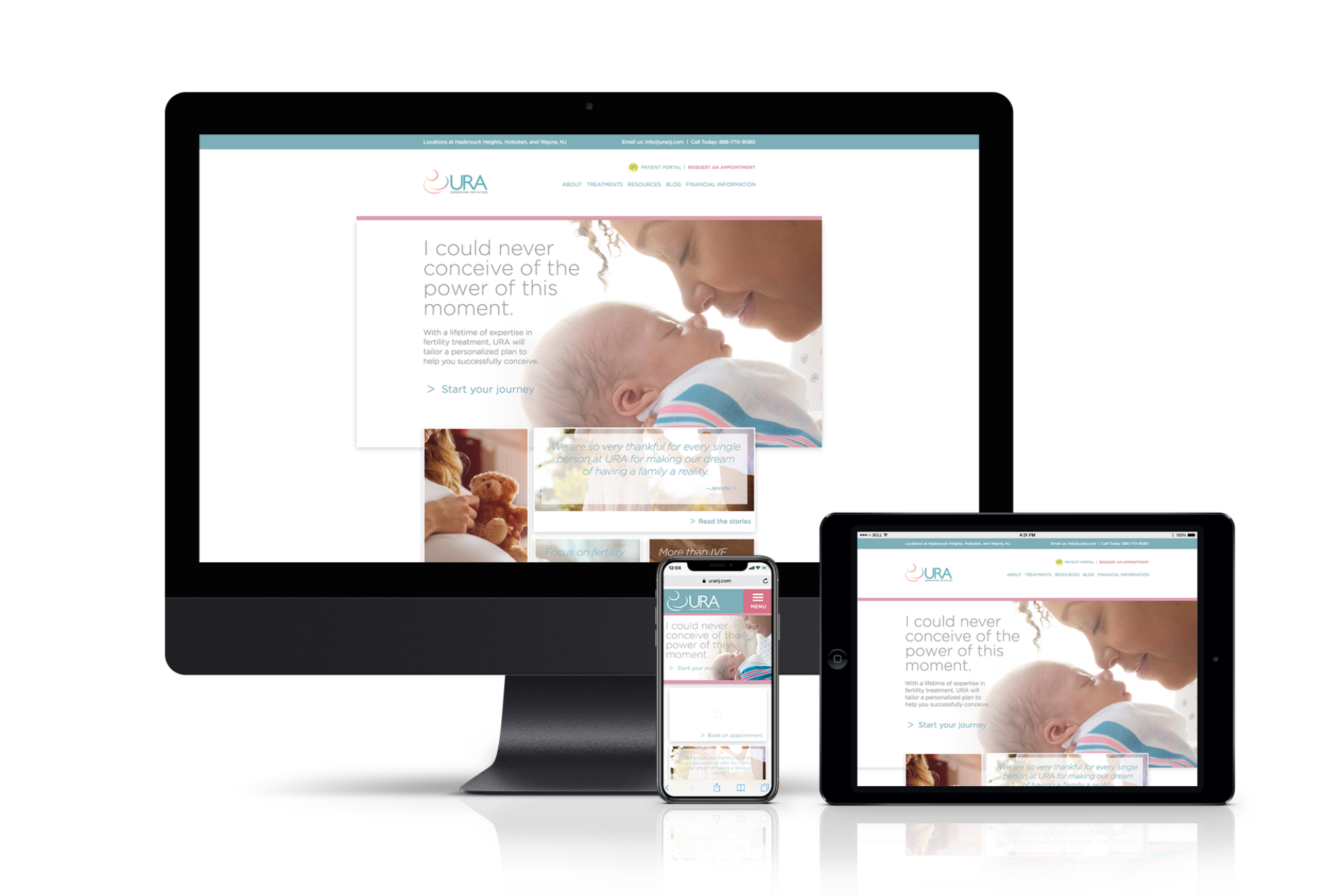
Once new branding was established, we moved into web design, structure and development. Using a combination of wire framing and design, RITTA came up with a clean and informative site that encourages users to make direct contact with URA for more information.

Development and Launch
Working with developers in WordPress, RITTA coded and launched the site on schedule, and it’s been a major success for URA – there’s been a jump in website contacts and appointments.
See the site: uranj.com