

UNIVERSITY REPRODUCTIVE ASSOCIATES REBRANDING
REIMAGINING PATIENT CONNECTIONS THROUGH HEALTHCARE MARKETING
Rebranding a prominent fertility practice is not just a design exercise. It requires empathy, precision, and a deep understanding of how brand, experience, and storytelling shape patient trust.
When University Reproductive Associates (URA) sought to evolve from a corporate, clinical image into one that reflected warmth, compassion, and personalized care, they needed a partner who could translate compassion and medical excellence into their marketing. Every visual, message, and touchpoint had to work together to create a clearer, more human brand.
URA turned to RITTA.
PROJECT STATS
- Practice nearly doubled through acquisition
- 2x GROWTH
- Quarterly local media impressions
- 1 MILLION
- Outperformed the 0.35% industry benchmark
- 0.54% CTR
RITTA’S RESULTS
Stronger brand. More new patients.
RITTA truly elevated the URA brand. We went from something that felt a bit too clinical to a brand that authentically represents who we are — a practice rooted in medical excellence, compassion, and truly personalized treatment. The difference is clear not just in our marketing, but in our day-to-day interactions with patients.
Adam Fechner, MD
Reproductive Endocrinology and Infertility
URA


URA BRAND TRANSFORMATION – THE CHALLENGE
URA was a highly respected fertility provider, but its brand felt too corporate and distant from the deeply personal experience of fertility care. The practice needed to shift from a technical, institutional image to one that communicated warmth, empathy, and trust — without diminishing its medical authority.
The complexity extended beyond aesthetics. URA’s brand, website, social presence, and marketing materials needed to align around a single, clear story: expert care delivered with genuine compassion. Every touchpoint — digital, social, print, and in-clinic — had to reinforce this new positioning consistently.
LET’S DISCUSS WHERE TO START
OUR SOLUTION
RITTA worked closely with URA’s leadership and clinical teams at every stage of the transformation.
Before creative development began, RITTA aligned with URA on the emotional and strategic positioning of the brand — ensuring the evolution would feel authentic, not cosmetic. This early alignment created a shared foundation that enabled faster, more confident decision-making throughout the process.
To anchor the transformation, RITTA developed a new visual identity centered around a distinctive logo featuring three elegant curves symbolizing the bond between parent and child. A refined color palette, modern typography (Gotham), and custom fertility-focused iconography created a cohesive system that balanced warmth and professionalism.
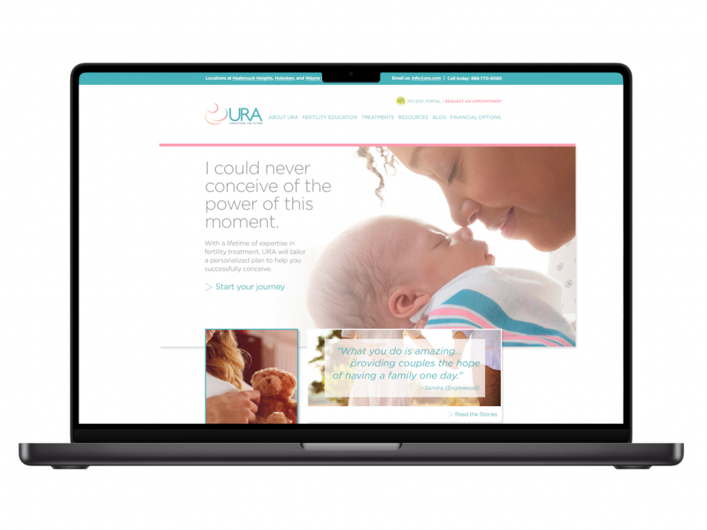
With this foundation in place, RITTA redesigned URA’s website from the ground up — using UX strategy, wireframing, and thoughtful design to create a more intuitive, educational, and patient-friendly experience that drove increased traffic and appointment bookings.
To bring the brand to life, RITTA implemented an integrated content and media strategy, including:
- On-site photography and videography capturing authentic practice moments
- A customized social media strategy that humanized URA’s doctors and staff
- Targeted digital media, sponsored content, and high-visibility mall standees
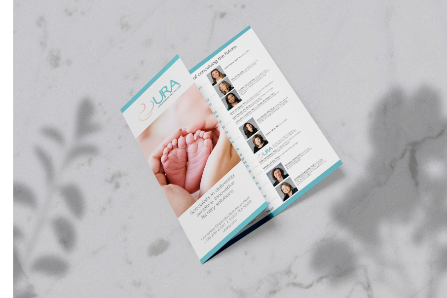
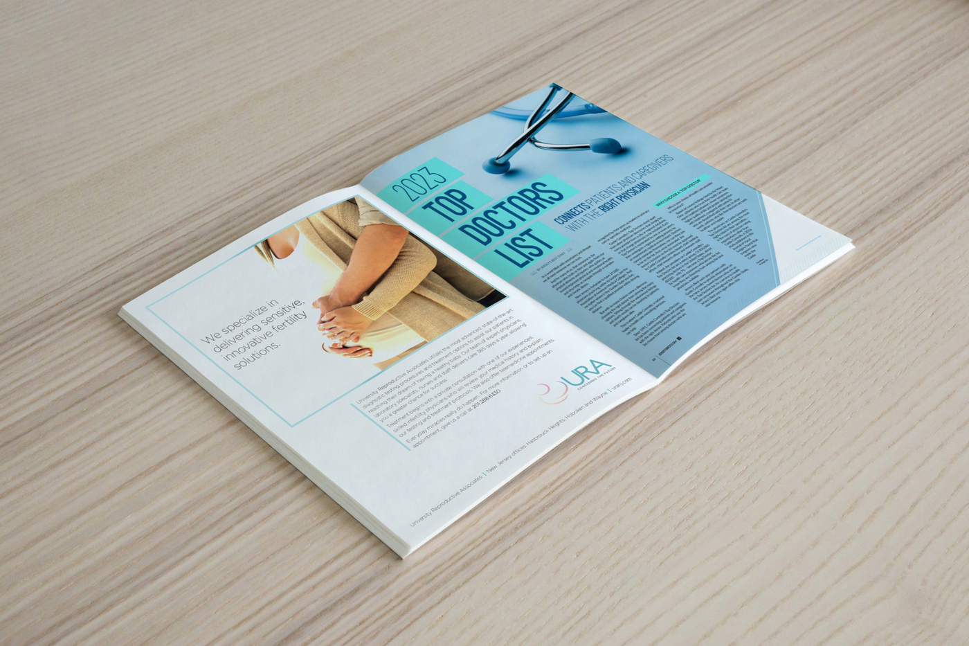
- A refreshed suite of marketing materials, including brochures, signage, and patient education tools
This holistic approach ensured that every asset, platform, and interaction reinforced URA’s new positioning — creating a more connected, supportive, and trusted brand experience for patients.

Frequently Asked Questions about Medical Branding
A major challenge in healthcare marketing today is that so many brands start to look and sound the same. When a practice is more clearly defined and differentiated, prospective patients are more likely to connect with it and remember it.
Branding becomes less about simply looking polished and more about creating trust, clarity, and a stronger emotional connection before a patient ever reaches out.